Project
Religious scholarship and devotional literature display a long history of paltry design, practically illegible typesetting, and dry-as-dust writing. Nevertheless, the market for these books persists, supported by scholars obligated to own the work of their colleagues, and lay church-goers eager to purchase piety. This somewhat odd market generally results in two categories of product: meticulously designed collector’s editions, and mass-market, haphazardly produced books and pamphlets, alluring in price but lacking in elegance.
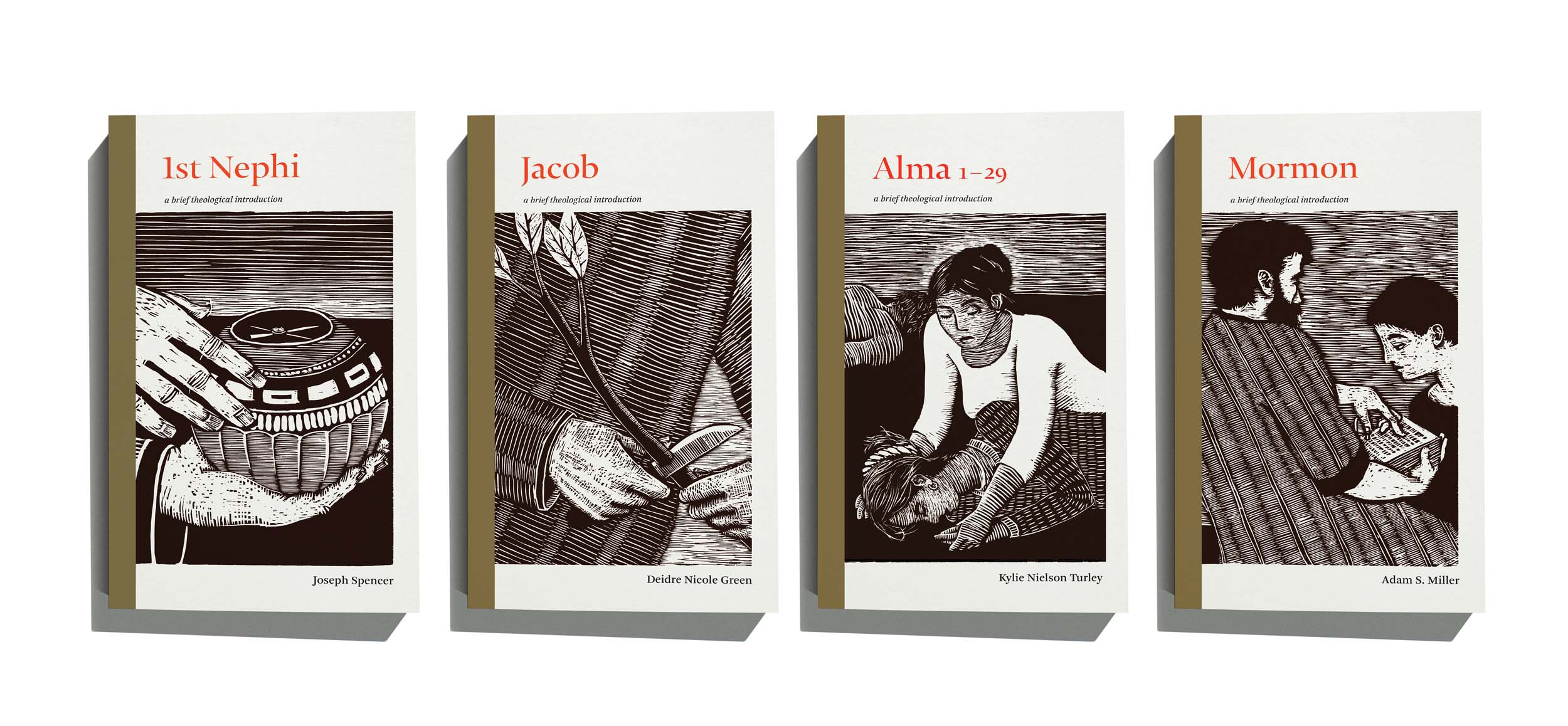
The Book of Mormon: A Brief Theological introduction was conceived as a series of books that would harvest the best of both categories: rigorous and compelling theological arguments, accessible in style, price, and religious fidelity to the lay church-goer. The book design needed to follow similar lines: luxurious to handle and peruse, unique and daring in visual style, while also being welcoming in legibility, artistic appeal, and price.
Beyond this general concept, the series strategy presented further design challenges: each of the twelve books in the series was written by a different author, each of whom wrote on one section of the Book of Mormon. With backgrounds in history, philosophy, theology, and literary studies, authors took full allowance not only in the scholarly approaches to the sacred text, but in the structure and linguistic formality of their writing. While some wrote tight analytical prose, others produced story-like narratives. This created a structural design challenge: to extend unity to books of varying lengths, styles, and authorial visions.
Further, the series editors hoped that these books would attract an audience that included both trained scholars and lay readers, while simultaneously appealing to an audience looking for religious inspiration. The design, then, needed to communicate that this series brought a new approach to religious scholarship and practical worship, while not alienating a general church-going audience. Above all, it needed to attract new readers to these books and the scriptural texts they represented. Given that the traditional religious book is often weighty, imposing, and difficult to read (visually and conceptually), these books needed to crack the mold, but not break it: be new and inviting, but not dangerous to the old faithful.
I sought out a design that was bespoke in every way, but affordable and welcoming to casual readers. I opted for small, lightweight paperbacks in the first edition, lending equity in the purchasing process by collapsing the typical division between hardback and paperback. Yet, these paperbacks were luxurious: de-bossed covers to simulate woodcut printing, french-folded flaps, uncoated paper, and pages specifically devoted to imagery and visual pacing. The book’s size was based on Renaissance-era page proportions, rather than modern standards that offer efficient printing but uncomfortable reading. On the inside, generous margins and relatively narrow columns of text speed up the reading process, but reduce the amount of information on each page.
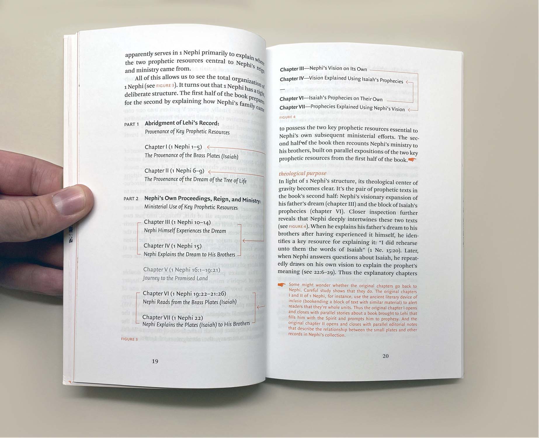
The typefaces used were chosen for their legibility and historical feel. The text of the book is typeset in Arnhem, Fred Smeijer’s 21st-century-take on late 18th-century Enlightenment-era letter-forms known for their sturdy legibility and clarity of form. Captions and figures are typeset in Quaadraat Sans, also by Fred Smeijers. I commissioned custom index numbers to delineate complex philosophical arguments, making them easier to follow and heightening the sense of organization and flow.
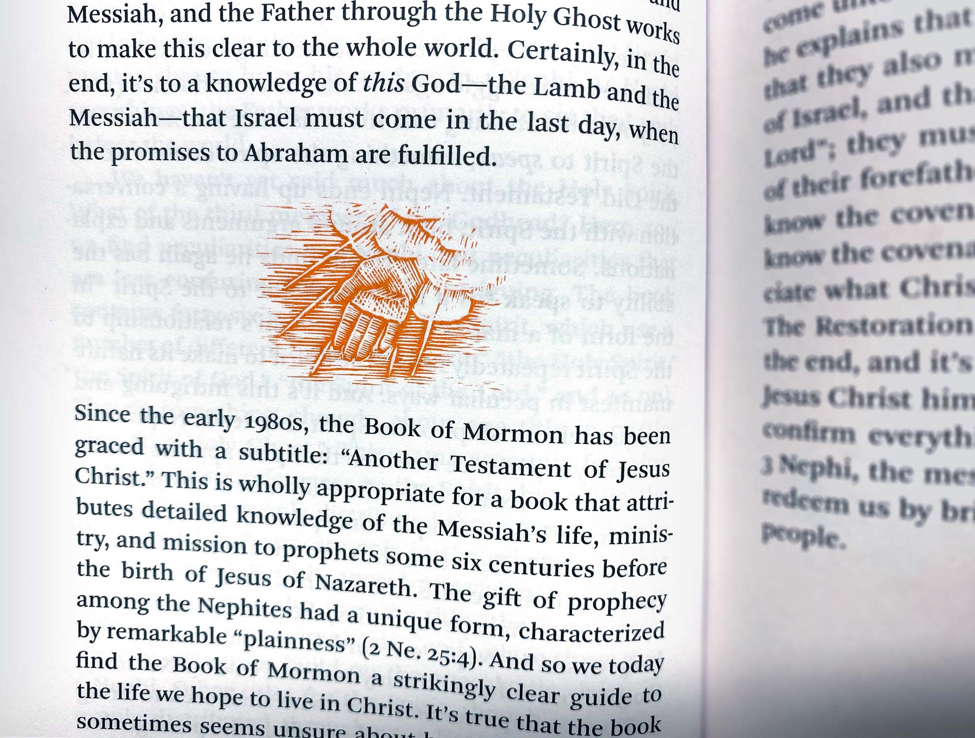
The books feature a gold, red, and black theme. The gold aludes to the Book of Mormon’s traditional origins as being written on gold plates. The orange-red is a contemporary take on the theological tradition of red-lettering important information and the historical importance of red texts as the second color used in printing.
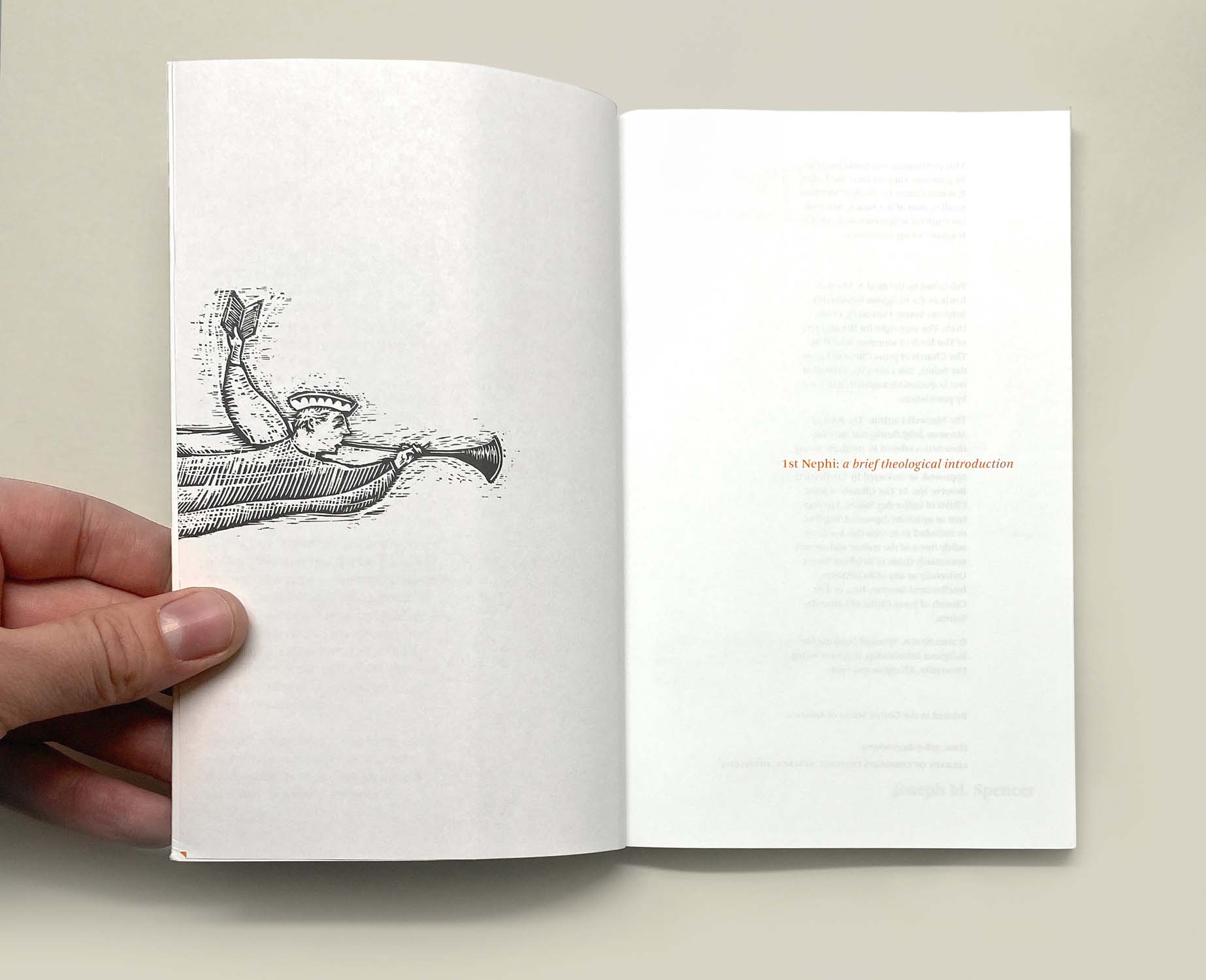
Each book received carefully-crafted visual imagery, inspired by medieval illuminated manuscripts. Charts and diagrams were custom-designed to integrate into the layout of the text, and to respect the strengths and weaknesses of the printing process. This departs from most other books in this genre, which tend to relegate figures and diagrams to an appendix, far-removed from the text they are meant to illustrate. Manicules (pointing figures), a staple of historical treatises and theological texts, point out informative footnotes, while scholarly citations and digressions are placed in unobtrusive end notes. Custom woodcut illustrations illuminate each cover and introduce new sections and chapters within the text.
Client
Team
Woodcut Illuminations - Brian Kershisnik
General Editors - Spencer Fluhman, Philip Barlow
Copywriting - Blair Hodges
Production Typesetting - Natalie Miles, Maria Camargo, Sage Perez