Project
While they may not be a large brewery, Lady Justice has an avid fan base with a far reaching mission. Their slogan, Great Beer. Better World, encapsulates their brand well. The majority of their profits are donated to promote women and girls throughout Colorado. We began working with the team as the brand was going through a transition. While they wanted their roots to shine through in their brand, they also wanted something more modern and versatile.
The old brand was primarily focused on the form of the lady, with bright colors as major brand elements. Many people confused the “Lady Justice” with “Lady Liberty.” Additionally, their limited release model created a large range of labels that often diluted the brand.
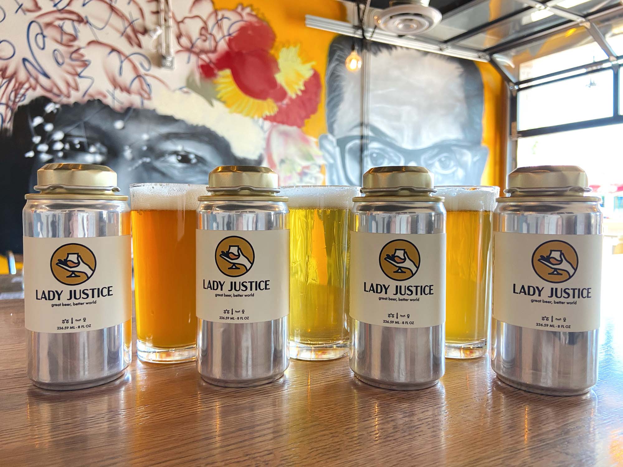
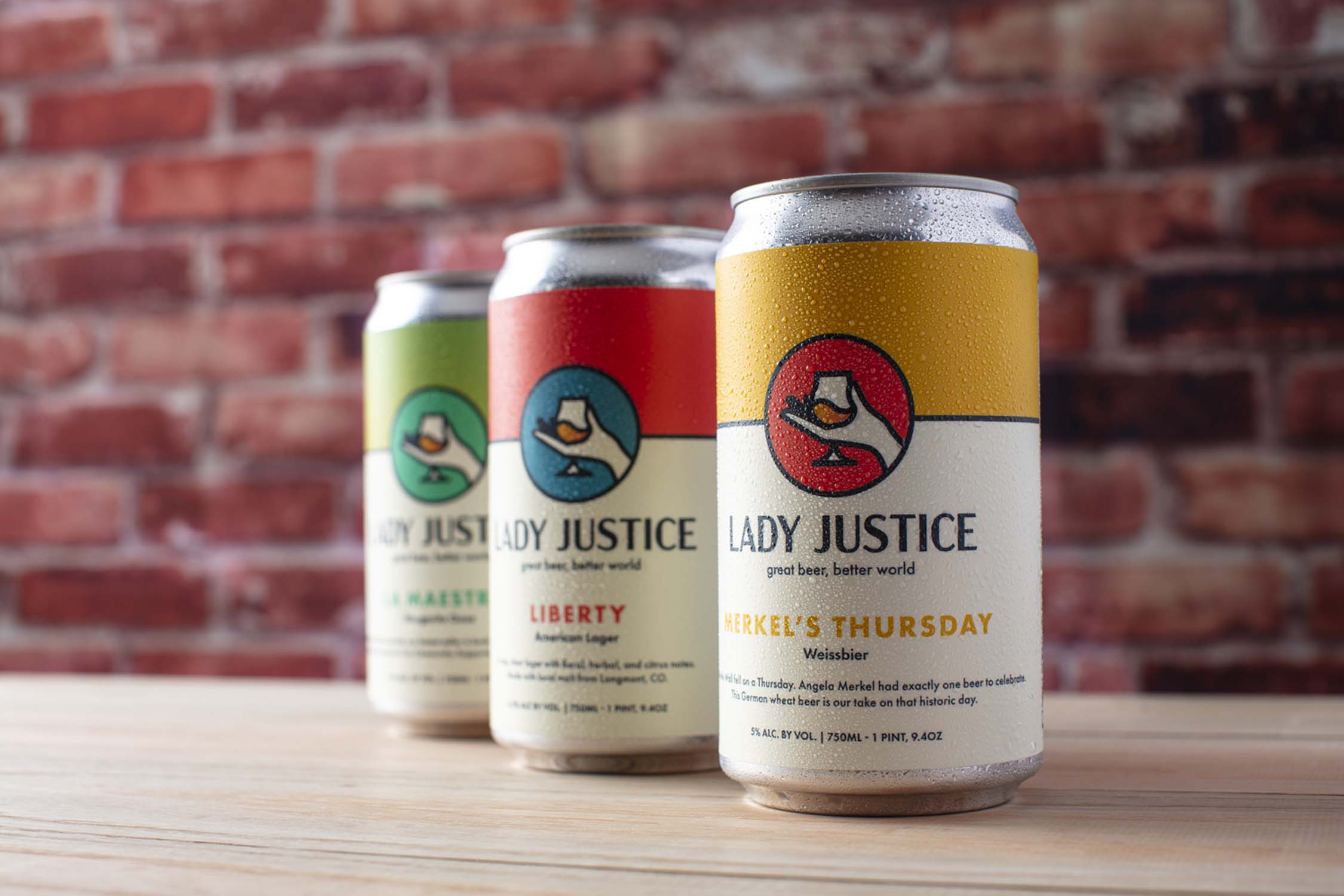
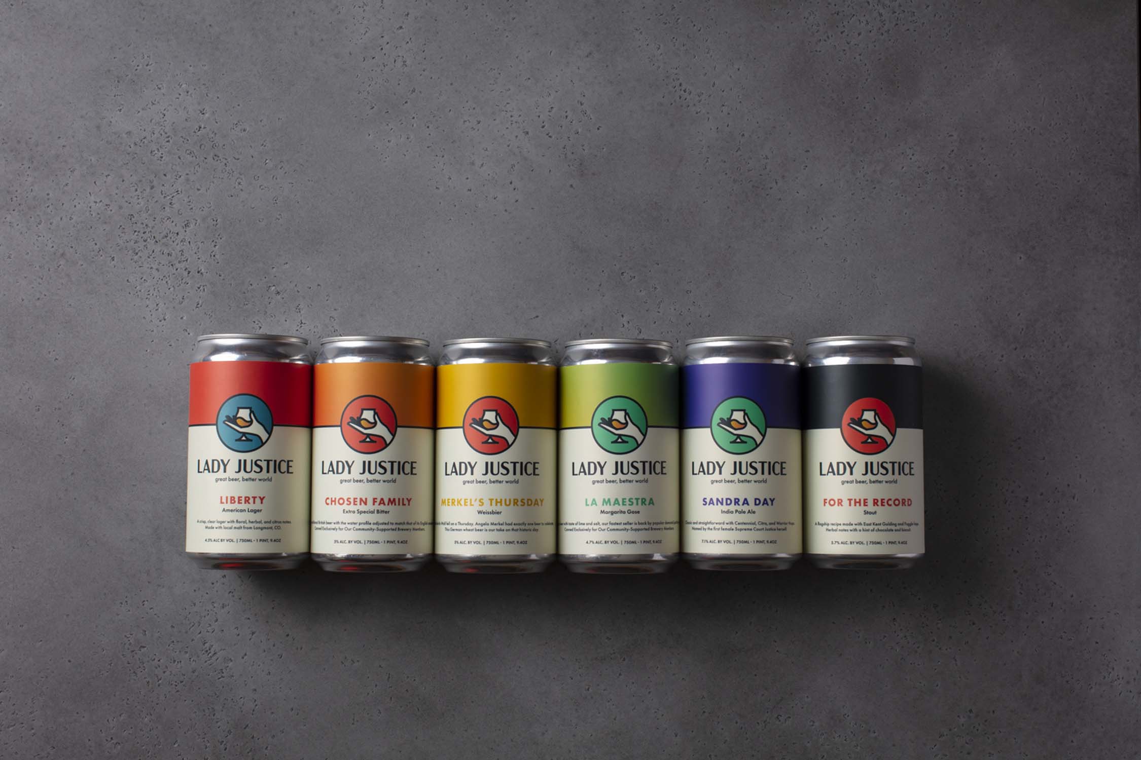
We worked with the Lady Justice team to create a simplified feminine icon and bold word mark in exchange for a complex and misunderstood symbol. Additionally, we looked for ways to incorporate bold color more, while reducing the number of colors per product. This eventually resulted to a brand family that potential customers would be able to immediately identify as Lady Justice.
Client
Team
Jake Hill - Designer