Project
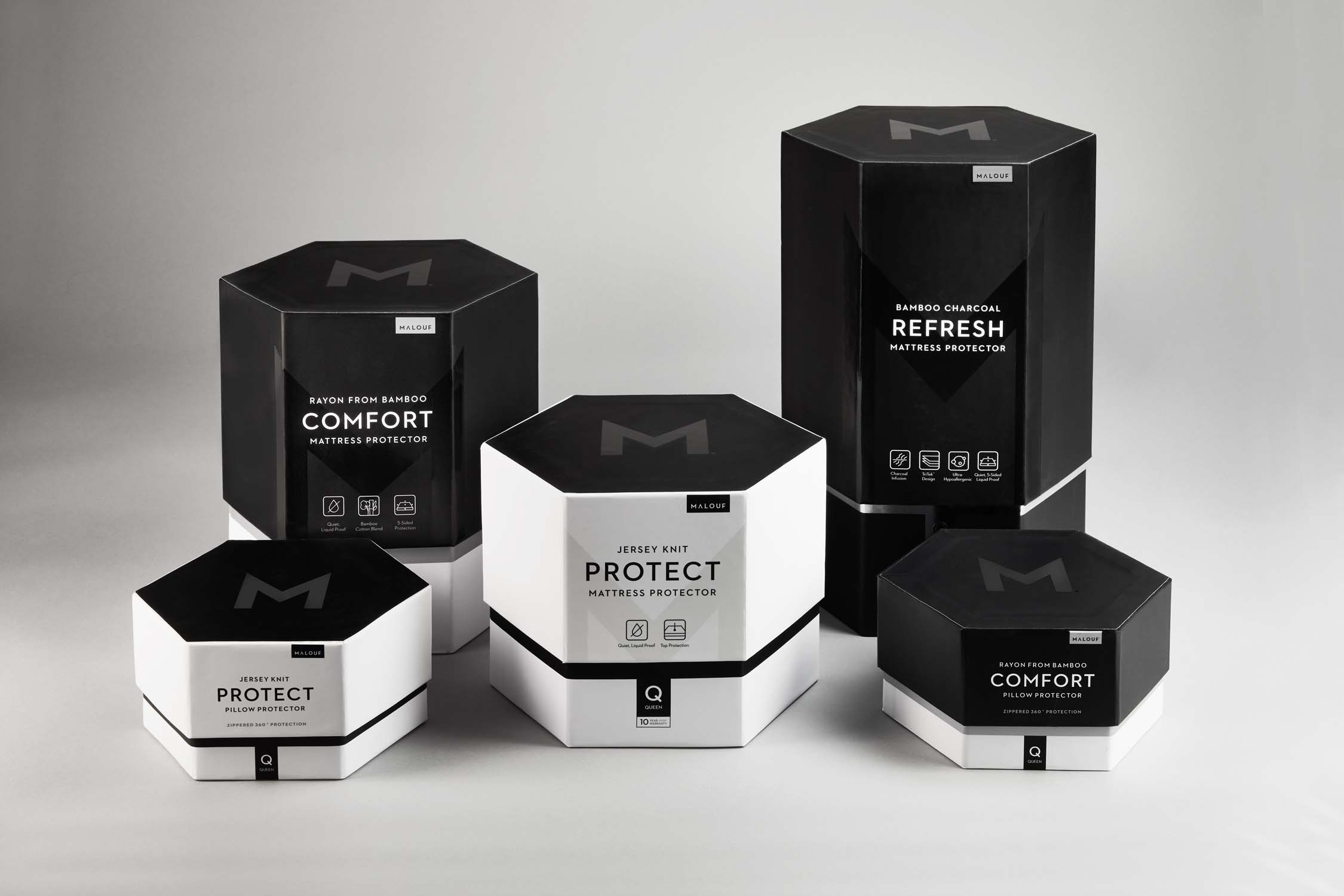
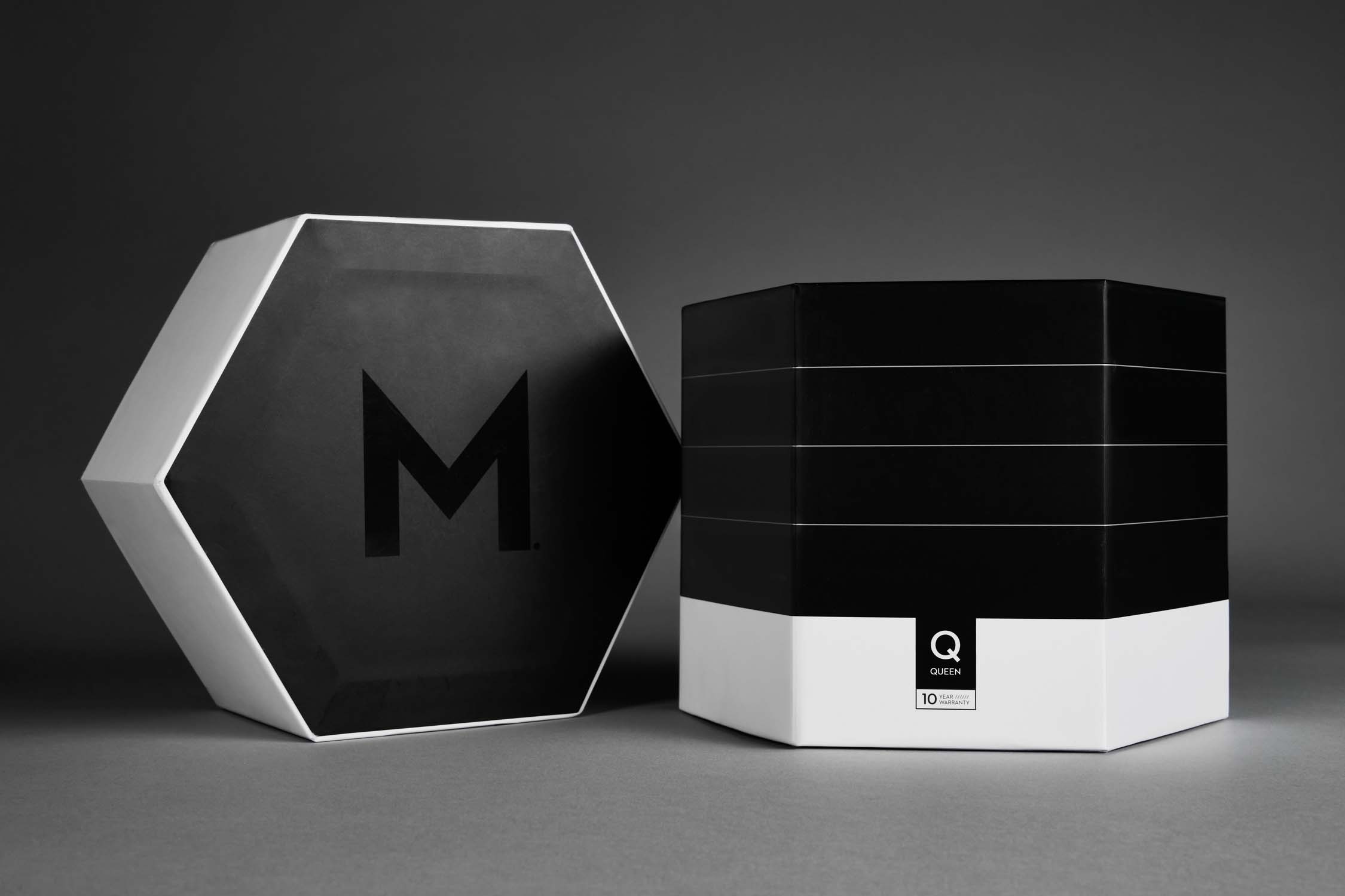
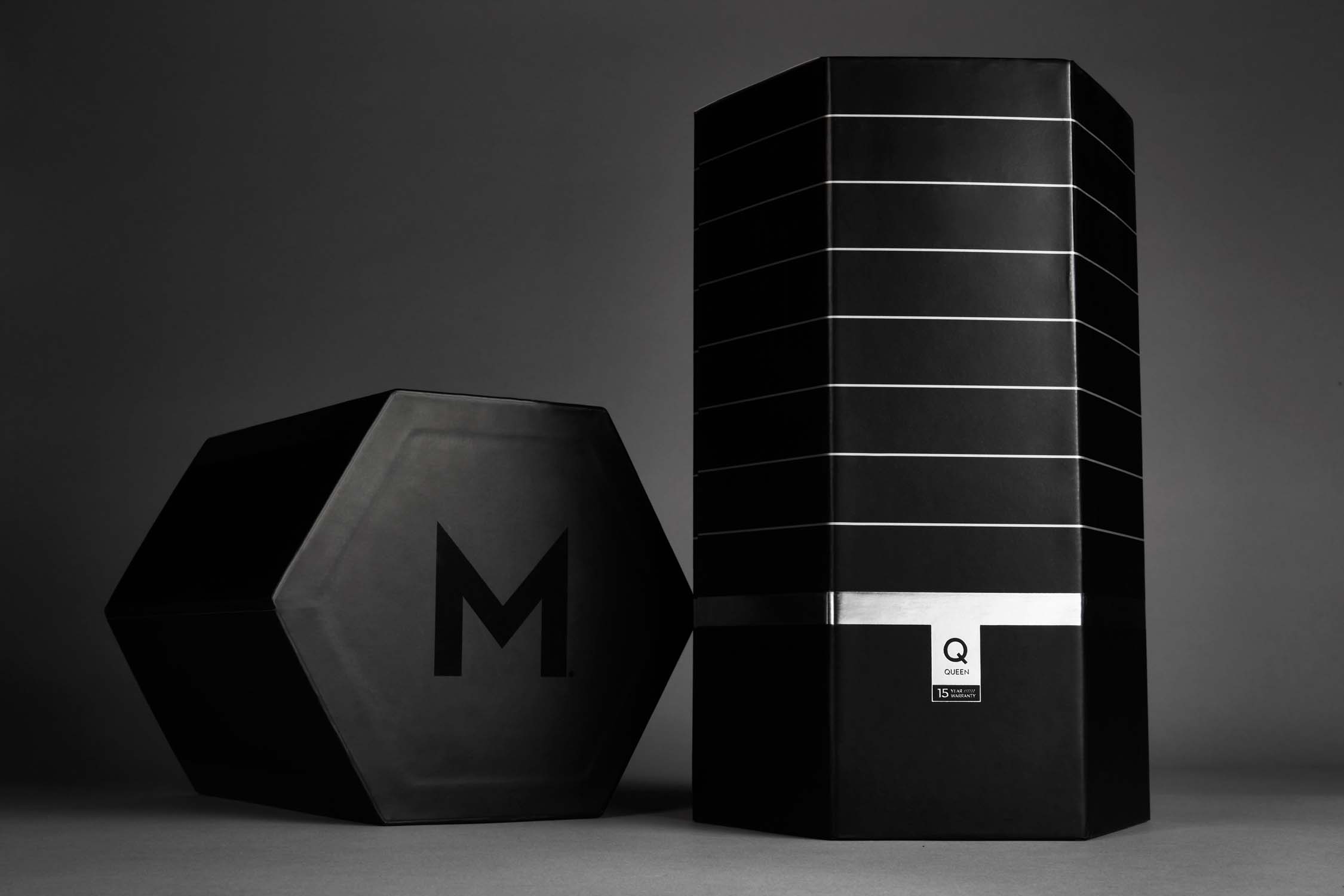
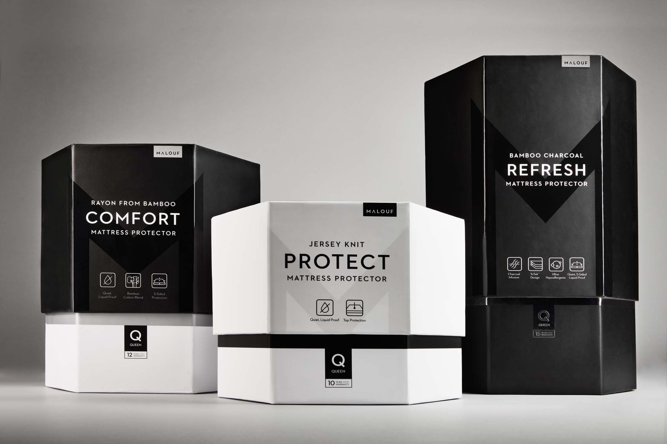
Presentation: The minimal, sleek design connotes luxury and feels more like a tech product than a soft good. Unlike sheets that need to be soft and cozy, protectors are all about technology and performance. The detailing under the lid provides an opening experience with discovery. The unique shape and finish stand out in a sea of PVC bags.
Storytelling: To assist the in-store sales representatives, the packaging size and finishes change to support a step-up story from good to better to best. Note how the placement of black on the package directly represents the coverage level—the Protect protects the TOP of the mattress, the Comfort protects the TOP and SIDES, and the Refresh protects ALL (360°) of the mattress. Iconography clearly displays additional features as you move up the line. Plus, foil touches are added on the top-tier and the increase in size implies a more robust product.
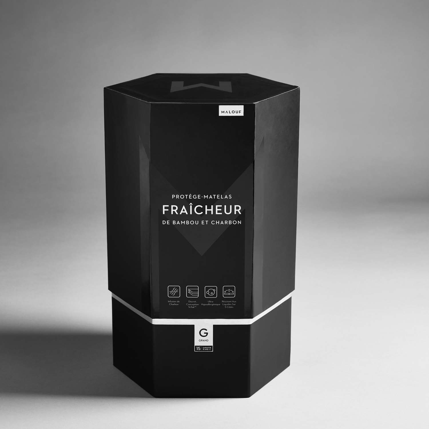
Bilingual: We worked to simplify the messaging enough that French content could be placed on one side and English content on the other. This allowed us to maintain a minimal, sleek look and has the added benefit of allowing stores across Canada to choose which language they want to display depending on their location.
Client
Team
Photographer - Koltin Darley
Beth Thompson - Copywriter
Product Developer - Jake Ozmun