Project
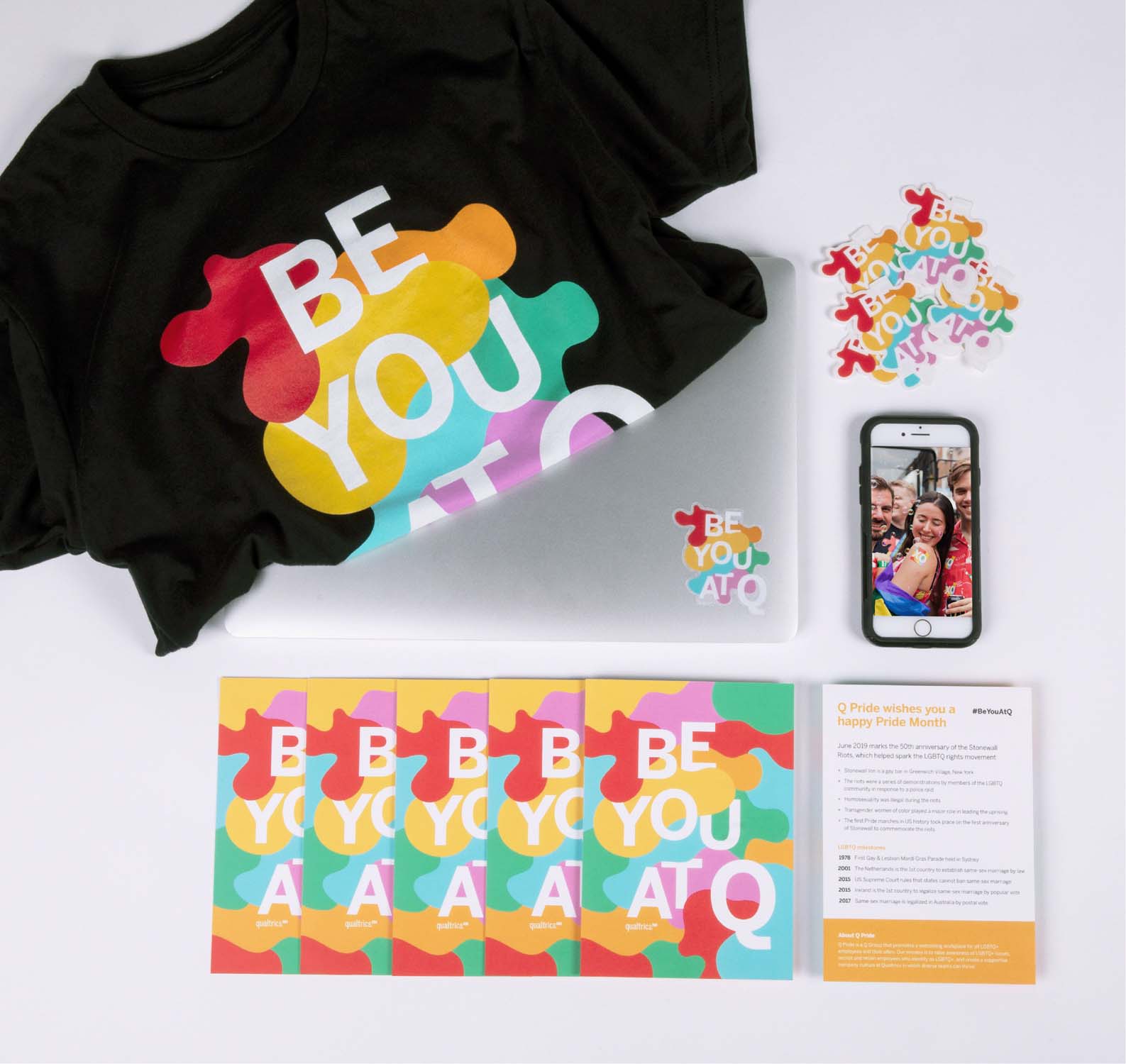
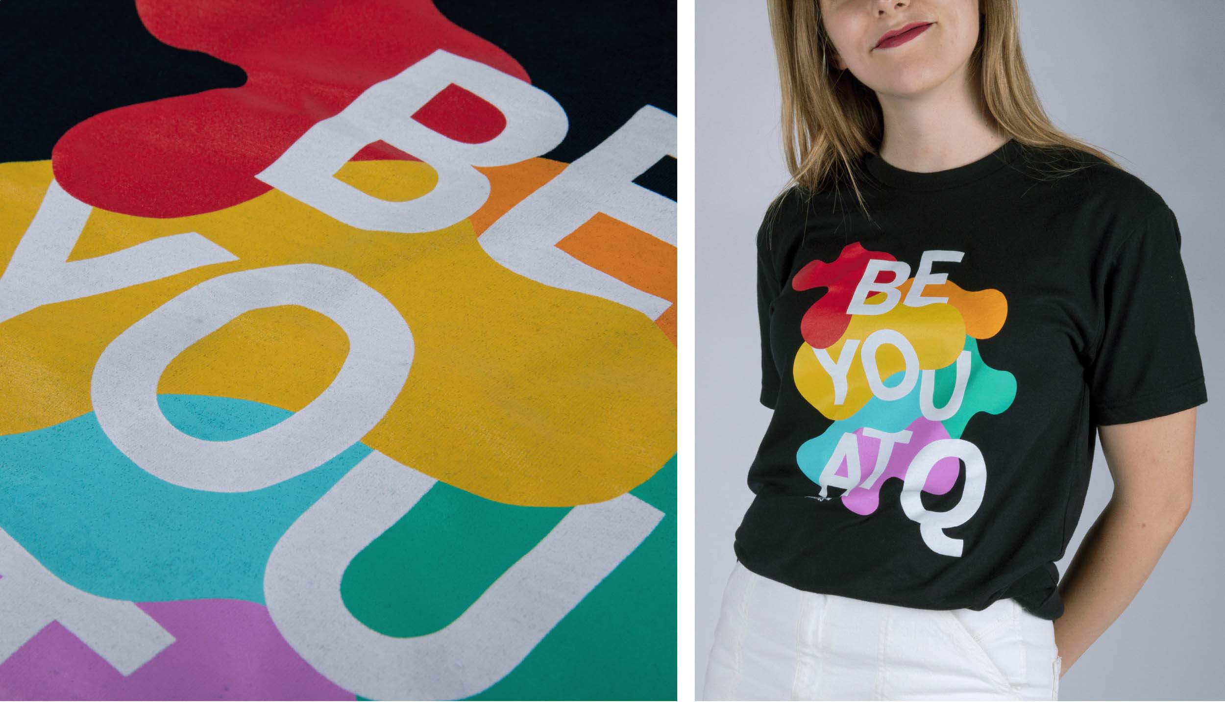
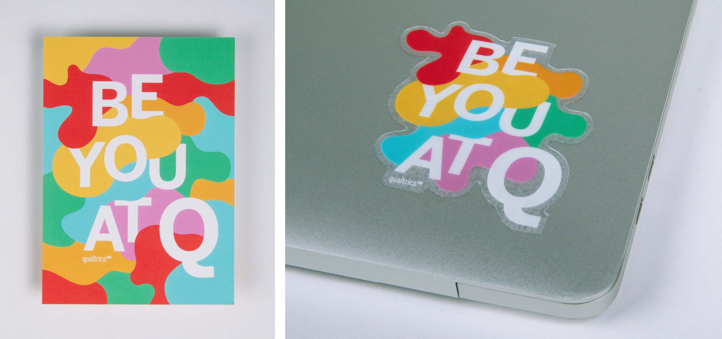
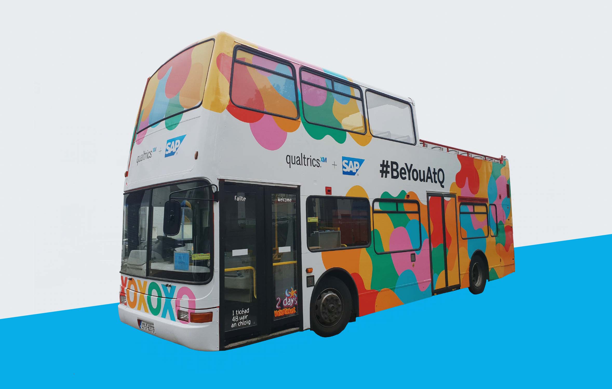
Entering the project I felt that the banded rainbow colors of the Pride flag felt tiring and expected and I wanted to do something new with the colors. The blobs represent the individuality of humanity, and especially the reclamation and empowerment of individual identity of the LGBTQ+ community. Each blob is different and special and unique. The color tones were adapted from the more classic pride colors to be more visually pleasing as clashing colors often found themselves randomly next to each other. The result still felt loud, proud, and drew the eye, as is appropriate to Pride festivities. Employees of Qualtrics were able to proudly wear the tagline “Be You at Q”, which represents the company values well.
Client
Qualtrics Pride
Team
Designer - Stephanie Ottehenning
Art Director - Stewart West
Art Director - Stewart West