Project
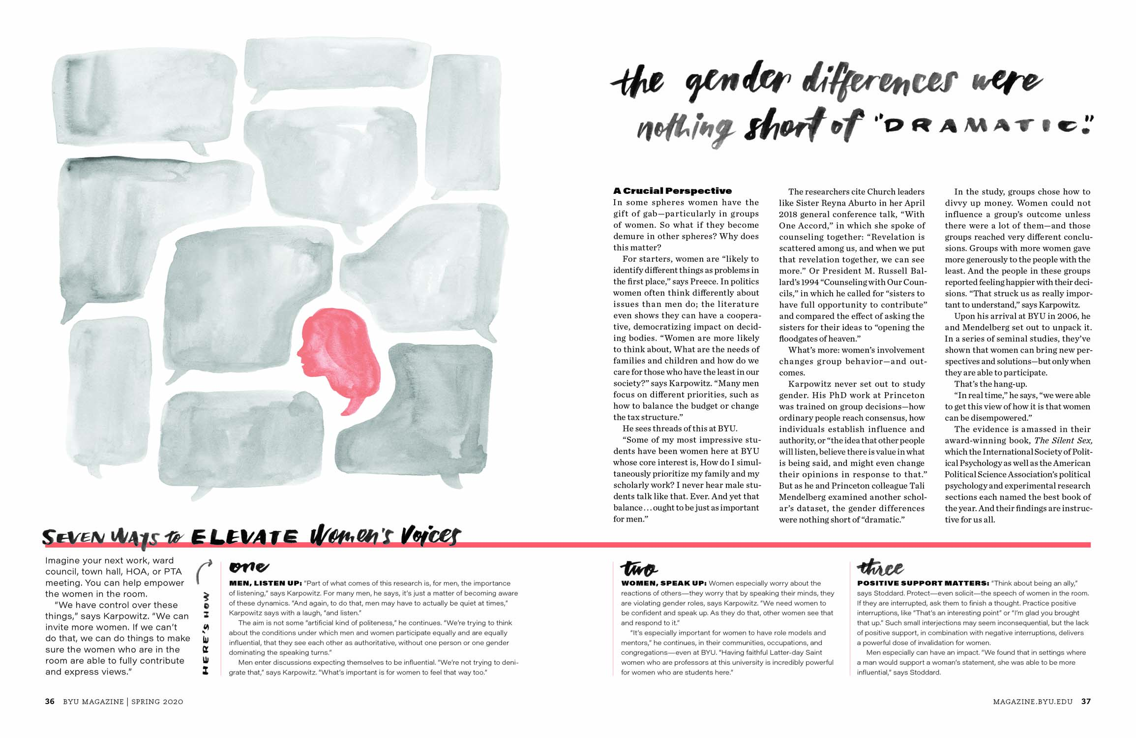
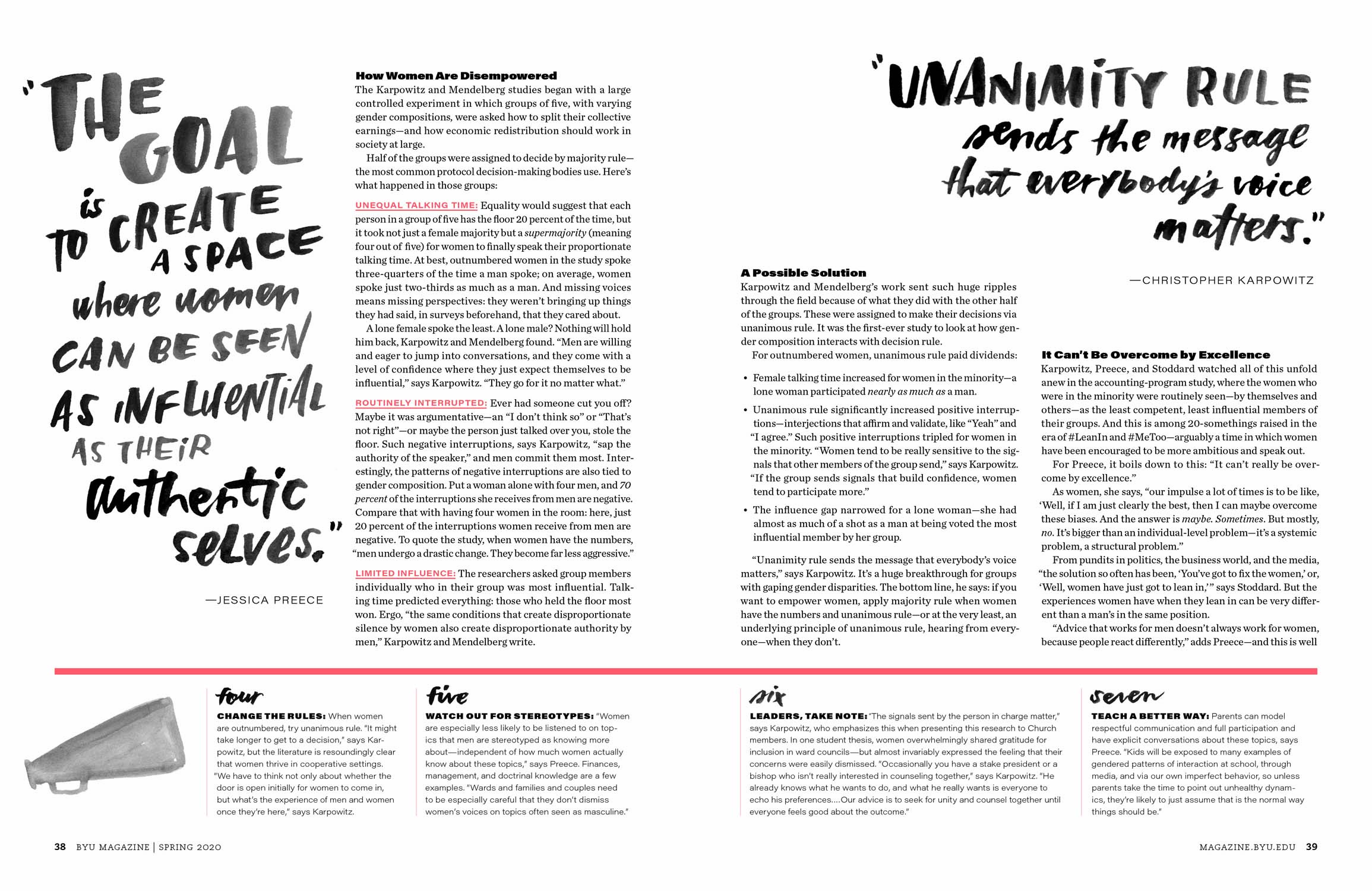
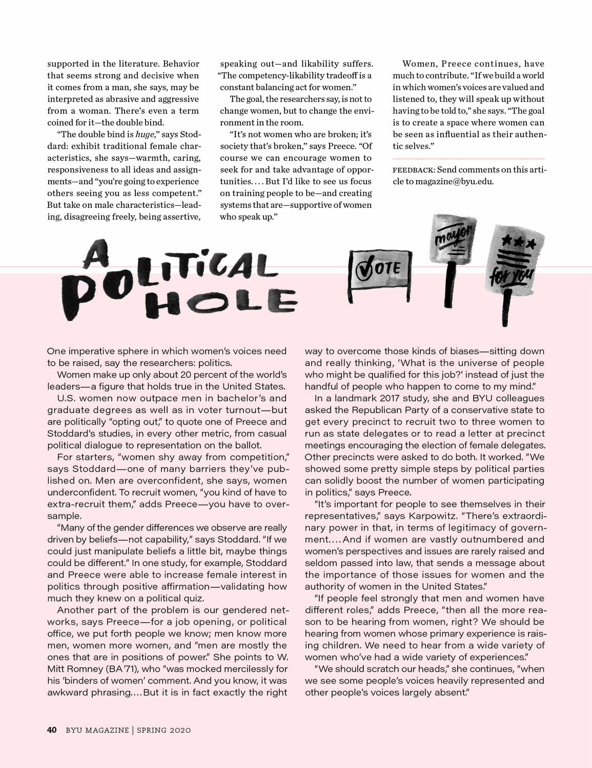
Presenting a touchy subject visually and allowing room for two different sidebars. Using the call-outs as the art helped maintain a certain feel of youthfulness to the story as a whole—rather than setting up photography of a woman among men in a conference room. The topic is kind of messy, and the lettering conveys that. It is bold, but feminine, which aligns with the views that females can be bold and the world can be better for it. The sidebars were treated differently on different pages which helped break the story into “bite-size” bits for easy reading.
Client
BYU Magazine
Team
Olivia Knudsen


