Project
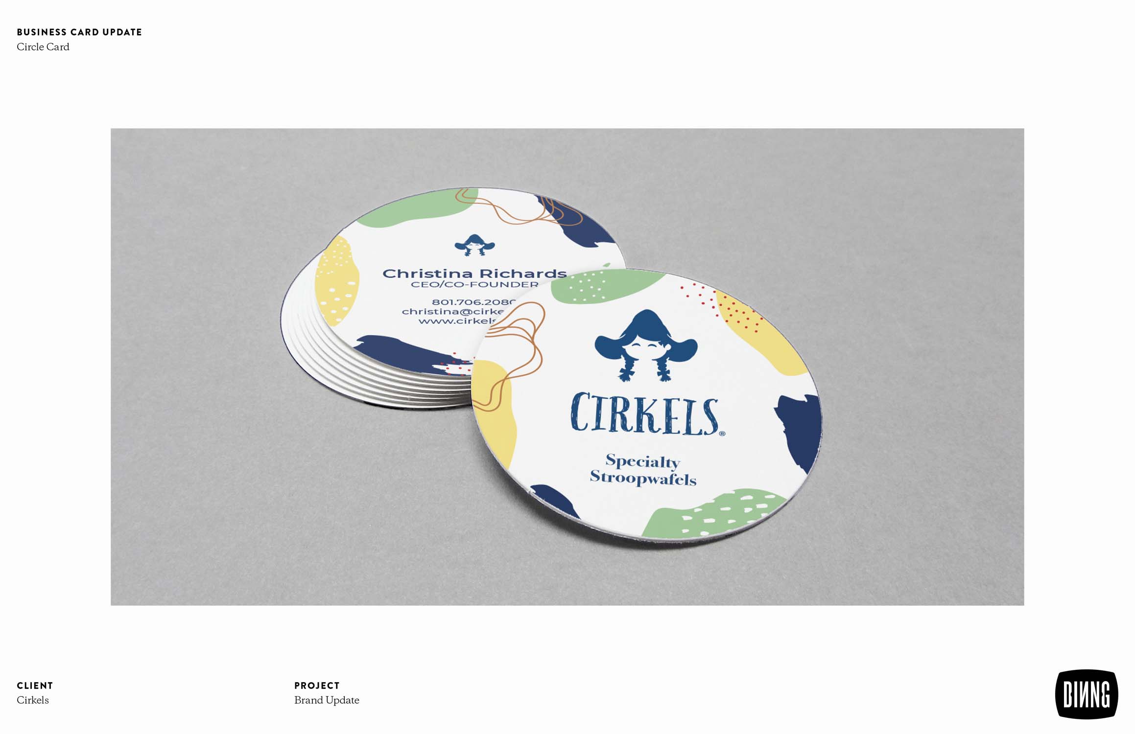
The Cirkels icon was updated by evolving the existing mark to better showcase their hand-made but high-end Dutch connection. We redrew the mark introducing features and details to improve recognition and connection.
The packaging went through a full exploration starting with updating the packaging substrate to better maintain the award-winning flavor of the product. From there we introduced an illustrative design that elevated the brand and better highlighted the product.
Client
Cirkels LLC.
Team
Dinng Design Team
Mark Romney - Creative Director
Camille Nugent - Senior Designer
Katelyn Pettit - Designer
Mark Romney - Creative Director
Camille Nugent - Senior Designer
Katelyn Pettit - Designer